
Imagine for a moment that the scene above is full of logos rather than people.
Now imagine that those logos are all vaguely similar and that they represent the logos of your competitors. Whether you have an existing logo or are about to create one, it’s important that your logo avoids becoming the Waldo of the scene.
Ensure that your logo has the following fundamental characteristics to help separate it from the pack:
Simple
Yikes. Simplicity is scary to most folks. However, a good logo is simple and achieves its goals. When you see a logo that is “all over the map”, awkward or disjointed (in terms of design), that tends to suggest to the audience that the business itself might be a bit unstable and “all over the map.” Keep a logo design simple in order to appeal to a greater number of prospects.
Recognizable and Memorable
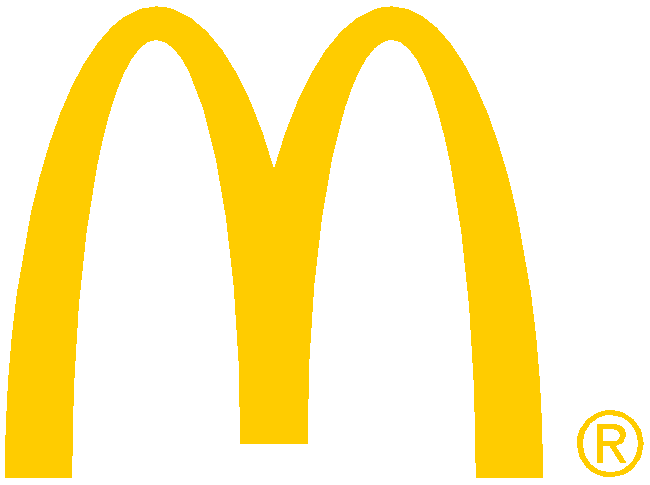
What kid doesn’t know those supremely identifiable golden arches when they emerge on the horizon of the next interstate exit? Do you need to read the word “McDonald’s” to recognize the logo? Not at all. The simple, golden arches do a good share of the visual work in making the logo recognizable and memorable.
From the foundation of your logo’s design, making it easily memorable and recognizable should underpin your efforts.
Relevant
FedEx’s logo contains the arrow in the “Ex”, which is relevant to transportation, and the font is clean and solid, which is relevant to FedEx’s professionalism.
If you have a realty company and you use a unicorn for your logo, I wouldn’t expect your prospects to invest any trust in your company. Consider the nature of your company and what you’re communicating to your prospects. Use the logo’s font and imagery to impress upon your prospects what your business is out to accomplish.
If you want to communicate that your company is credible and trustworthy, use a font and an iconic image that reinforces those ideas. If your company is fun and lighthearted, maybe the unicorn and a handwritten font are appropriate. Whatever you do, ensure the logo is relevant to your business.
Lasting
The Coca-Cola logo has been around since 1886 in the same basic form as we have it today.
Whether choosing or creating your logo, you have a decision to make. You can get one cheaply made with a predictable level of low quality. Or you can seek to invest in it. It’s likely that if you hire a designer to craft your logo for your company, you’ll find that a higher cost is more likely associated with a serious approach. “You get what you pay” for applies here.
With a more serious approach, you’ll find a logo solution that is lasting.
A logo that lasts should:
- Be free of design fads, those trends that tend to pass or get replaced. You probably don’t want your logo replaced, right?
- Use a font (typeface) that isn’t overused or ridiculed (like Comic Sans or Papyrus).
- Avoid complexity. Communicate the important characteristics of your company in as few and creative ways as possible.
Remember that your logo isn’t meant to be used up and thrown away. Whether you create it or hire someone who can, choose a logo that you can envision lasting beyond your lifetime.
So you know you need a logo, but don’t want to create one on your own? Maybe you have a logo that is experiencing a Waldo problem. Let us help you. We have the experience necessary to create a logo for you or refresh a logo that might not be hitting the mark for your business goals.
Leave A Comment